| Case
Study
The Client
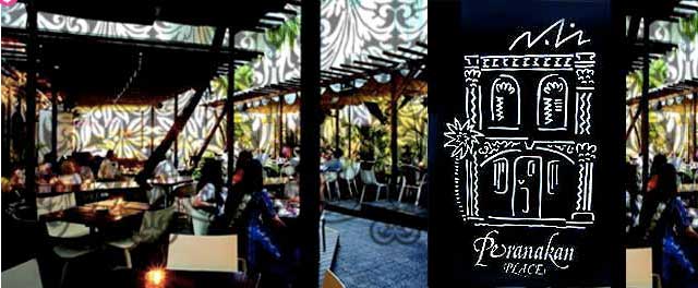
Peranakan Place
Sandwiched between Orchard Emerald and Centrepoint lies Peranakan Place, a collection of 6 ethnic Peranakan shop houses, which have been lovingly refurbished to their former glory with decorative tiles, bold arches and fretwork painted in pastel colours. Through the course of the last decade and a half, Peranakan Place Complex has been through a metamorphosis cycle, which has seen the venue through a myriad of incarnations. And now, in 2006, the Singapore Heritage Board landmark presents its quartet of outlets, each with a distinct personality.
The Challenge
In 1990s, when DB was approached to do a branding identity for this project, Peranakan Place was a small row of dilapidated shop houses. The theme was to be Peranakan, based on a vibrant Chinese-Malay culture which is part of Singapore’s Heritage. The façade, F&B outlets and shops had a reflect this common theme to make this complex a unique lifestyle concept at that time.
The Solution
The shop houses were carefully restored to their former glory and what better tribute than to design the branding identity around this distinctive. This brand was featured in all the retail collaterals. The shopping bags was also fashioned on the old fashion Chinese provision shop brown bags which won the SILVER AWARD at the 1993 Creative Circle Awards in Singapore. Bibi’s Restaurant took its inspiration from a set of ceramic tiles that lined the old shop houses. While the complex has gone through many changes since, the brand identity still remains throughout the complex as well as the new owner’s website. |